How to Create a Pie Chart in Excel
Pie charts are quite easy to create in Excel 2007 and
Excel 2010. In case you're not sure what a Pie Chart is, here's the
basic one you'll be creating. Later, you'll add some formatting to this:

To make a start, you need to highlight some data. If you've
been following along with the previous
tutorials, then you'll have some viewing figures data. You've created
a 2D chart with the BBC data. This time we'll use the ITV data. If you
don't have this data, create the following simple spreadsheet. The cells
to use are D4 to E14:

- Click inside cell E4 and change "Millions" to ITV, if you already have the data from a previous lesson
- Highlight the cells D4 to E14
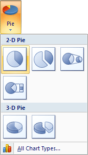
- Click the Insert menu at the top of Excel
- Locate the Chart panel, and the Pie item:

In Excel 2013, the Pie chart is harder to spot. But it's
highlighted in green in the image below:

Click the down arrow and select the first Pie chart:
- A new Pie chart is inserted
- Move your new pie chart by dragging it to a new location
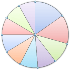
- Notice how all the segments of the pie chart are the same colour in Excel 2007:

To get different colours, make sure that your chart is
selected and locate the Chart Style panel:

Click the down arrow to the right of the Chart Style
panel to reveal the available styles :
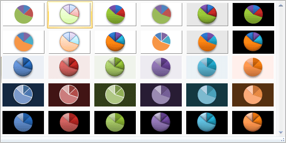
We've gone for the second one, Style two. If you haven't
got this style, select a similar one, such as style 4 in Excel 2013.
The chart will then look like this (your labels may well be at the bottom,
though, depending on which version of Excel you have):
But it looks pretty good for just a few mouse clicks!
We can still do a bit more to it, though. In the next part, you'll see
how to add the viewing figures to the pie chart segments.
Add Data Labels to a Pie Chart
In the previous tutorial,
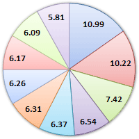
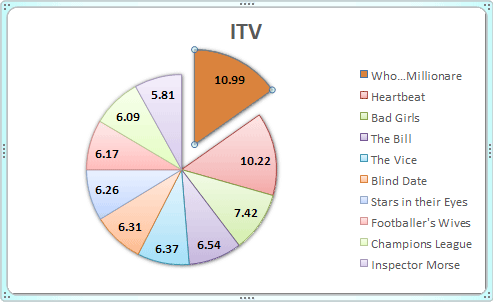
you created an Excel Pie Chart that looks something like this:
At the moment, though, there's no information about what
each segment represents. We're going to add the numbers from our ITV
viewing figures. These ones:
To add the numbers from our E column (the viewing figures),
left click on the pie chart itself to select it:
The chart is selected when you can see all those blue
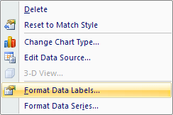
circles surrounding it. Now right click the chart. You should get the
following menu:


From the menu, select Add Data Labels. New data
labels will then appear on your chart:

The values are in percentages in Excel 2007, however.
To change this, right click your chart again. From the menu, select
Format Data Labels:
When you click Format Data Labels , you should get a dialogue
box. This one:
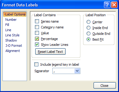
If there's a tick in Percentage, untick this and select
Value:

Your chart will then have the correct numbers:
Overall, the chart looks OK. But we can add some formatting
to it. in the next part, you'll see how to format each individual segement
of the Pie Chart. We'll change the colour of one segement, and separate
it.
How to Format Pie Chart segments
From the previous lesson,
your Pie Chart segements look like this:
You can change the colour of each slice of your pie chart,
and even move a slice. Let's change the colours first.
Change the Colour of a Pie Chart Segement
Left click on the pie chart itself to select it:
It is selected when you can see those round handles. Now
left click on one of the segments to select just that individual slice.
It's a little bit tricky, but if you do it right your pie chart should
look like this:

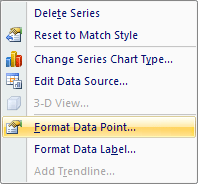
In the image above, only the 10.99 segment is selected.
You should see round circles surrounding just that segment. Now right
click your segment and, from the menu that appears, select Format
Data Point:
You should see the following dialogue box appears (you'll
see a panel appear on the right of your screen in Excel 2013. The same
options will be available as the ones below, however):

Click on Fill from the options on the left (Excel
2013 user should click the paint bucket icon at the top, then click
to expand the Fill option). The dialogue box changes to this:

There are quite a lot of options to experiment with. But
select the Solid Fill option:

Now click the colour picker, and choose a new colour
for the segment:

We've gone for a dark orange colour, but select any colour
you like.
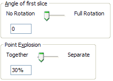
Move a Pie Chart Segement in Excel
To move the slice that you've just coloured, click back
on Series Options from the options on the left:
In Excel 2013, click the three bars icon:

Set the Point Explosion slider to about 30%
Now click the Close button. Your chart should look something
like this one:
Change the rest of the slices in exactly the same way.
You can format the rest of the chart exactly like you did for the
Bar chart. But it looks quite impressive as it is!
No comments:
Post a Comment