How to Sort Data
Section three of this course is really all about charts.
Later, you'll see how to create a variety of charts and chart styles
with Excel. Microsoft have really revamped chart creation from Excel
2007 onwards. If you've ever used previous versions of the software,
you'll appreciate how easy it is to produce impressive results.
First, though, we'll tackle the subject of how to sort data. The two
subjects are not really related, but the data going in to our charts
is a good opportunity to learn about this important topic.Sorting Data in Excel 2007 to 2013
To make a start, you need to create the spreadsheet below. You don't need to use the same colours as ours, but reproduce the data and the headings exactly as they are in this one:
Our spreadsheet is all about the viewing figures for the
two main TV channels in the UK. The data is a bit old, but that's not
important. As long as we have some nice information to sort, that's
what matters.
The viewing figures for ITV have been sorted, from the highest first
to the lowest last. The BBC1 figures are still waiting to be sorted.
Let's see how to do that now.Descending Sort in Excel 2007 to 2013
We want to sort the BBC1 viewing figures in the same way
that the ITV figures have been sorted. We'll put the highest programme
first and the lowest last. This is called a Descending Sort. If you
do it the other way round, it's known as an Ascending Sort.
The first thing to do is to highlight the information that you want
to sort. In your spreadsheet, highlight cells A5 to B14. The crucial
thing to remember when you want to sort data in Excel is to include
the text as well as the numbers. If you don't, you'll end up with a
spreadsheet where the numbers don't relate to the information, which
could spell disaster in bigger spreadsheets!Your highlighted spreadsheet, though, should look like this one:

To sort your BBC 1 viewing figures, do the following:
- From the Excel tabs at the top of the screen, click Data:

- From the Sort & Filter panel, click Sort
- A dialogue box appears:
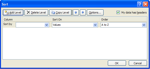
The Sort By drop-down list seems empty. Click the
down arrow to reveal the columns you selected:

We want to sort this by the values in the Millions column.
So select Millions from the Sort by list.
Sort On is OK for us - it has Values. But click to see the options
in the drop down list:
Values is the one you'll use the most. Once we
have a Sort By and Sort On option selected, we can then
move on to the Order.
Click the down arrow to see the options on the Order list:
Select Largest to Smallest. Your Sort dialogue
box should then look like this:

If you clicked OK, your data would be sorted. But the
level buttons at the top can come in handy. If two items in your data
have the same numbers, then you can specify what to sort by next. For
example, if we have two programmes that have 6.3 million viewers, we
could specify that the names of the programmes be sorted alphabetically.
To do this, click the Add Level button, and you'll see some
additional choices appear. You'll see the same lists as the Sort By
box. If you select Column A, and then Descending, Excel will do an alphabetical
sort if two items have the same viewing figures.
In the image above, we've added a "Then By"
part, just in case there is a tie. You don't have to do this, as we
have no numbers that are the same. Click OK to sort your data, though.
If everything went well, your sorted data should look like this:
Create an Excel Chart
We’re now going to create a chart from our BBC1 Viewing
figures. If you haven't yet completed the sorting tutorial, go back
one page and follow along with the lesson. You'll then have a some
sorted viewing figures to create a chart from.
When our chart is finished, though, it will look like this: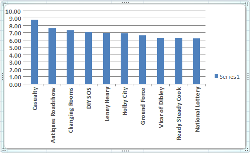
A little later, you'll see how to improve on this basic
chart.
To start making your chart, highlight the BBC1 programmes,
and the viewing figures. If you have just finished the sorting section,
this data should still be highlighted, and look like this:
With your programmes and the viewing figures highlighted,
do this:
- From the tabs on the Excel Ribbon, click on Insert
- Locate the Charts panel. It looks like this in Excel 2007:

In later versions of Excel, the Charts panel looks like
this:
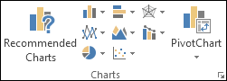
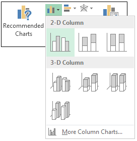
For this first one, we'll create a Column Chart. So, in
Excel 2007, click the down arrow on the Column item of the Chart
Panel. You'll see a list of available charts to choose from. Select
the first one, the chart highlighted below (2D Column):

The Column drop down list in later versions of Excel looks
like this:
When you make your selection, a new chart appears on the
same spreadsheet that you have open. The chart should look the same
as the one at the top if this page.
But notice that the Excel Ribbon has changed. The design
menu is selected, along with options for Chart Layouts:

In Excel 2013, you'll see these layouts on the left, in
the Chart Layouts panel, under Quick Layouts:

Also on the Design Ribbon, you'll see options for Chart
styles:

How to Move and Resize a Chart
You might find that your chart from the
previous lesson is covering your data. In the image below, our chart
is overlapping the ITV data. To move it, hold your mouse over the chart
until your cursor changes shape: (We found that the best place for your
mouse is over the dots in Excel 2007, as we had problems moving a chart
when the cursor was anywhere else! Moving charts in later versions of
Excel is easier.)

Press and hold down the mouse button when your cursor
looks like the one in the image above, and then drag your chart to a
new location. In the image below, we've placed the chart below the data.

You can also place your chart in a different worksheet.
To do this in Excel 2007, right click anywhere on your chart. From the
menu, select Move Chart:

In Excel 2010 and 2013 there is a Location panel
to the right of Chart Styles. Click the Move Chart item:
In all versions, you'll then get a dialogue box popping
up:

If you want your chart in a new worksheet, select the
first option. Then delete the text "Chart1" from the textbox,
and then type a name of your own.
If you look along the bottom of Excel , you'll see Sheet1,
Sheet2, and Sheet3. Your data is in Sheet1. If you click the drop down
list to the right of Object in on the dialogue box above, you'll
see the other worksheets you have open. You can select one from the
list and click OK. But for this first chart, leave it in Sheet1.
How to Resize an Excel Chart
You can resize a chart, and any elements on it, by moving
your mouse over the sizing handles. For the chart itself, the sizing
handles are the dots around the edges of the chart in Excel 2007:

In later versions, the sizing handles are white squares:

When your mouse changes shape to a double-headed arrow,
hold down your left mouse button. Then drag to a new location. You can
resize using the corners, or the edges..

Chart Styles and Chart Layouts
You can easily change the Style of your chart. If you
can't see the Styles, click anywhere on your chart to select it, and
you should see the Ribbon change. The Styles will look like this in
Excel 2007:
In later versions of Excel, your Chart Styles will look
like this:
Click on any chart style, and your chart will change.
To see more styles, click the arrows to the right of the Chart Styles
panel:

You'll then see a drop down sheet of new styles (Excel
2007):
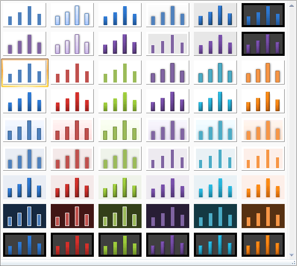
And here's the Styles in Excel 2013:

Work your way through the Styles, and click on each one
in turn. Watch what happens to your chart when you select a style.
Chart Layouts
You can also change the layout of your chart in the same way. Locate the Chart Layout panel on the Design tab of the Excel Ribbon bar. It looks like this in Excel 2007:
In later versions you may have to click the Quick Layout
option on the Chart Layouts panel:
Click the down arrow to the right of the Chart Layouts
panel to see the available layouts you can choose from:

Again, click on each one in turn and see what happens
to your chart. In the image below, we've gone for Layout 10:

Changing the Chart Type - 2D Bar Charts
You can change the type of chart, as well. Instead of
having a 2D column chart, as above, you can have a 2D bar chart. To
change the chart type, locate the Type panel on the Excel Ribbon
bar (you need to have your chart selected to see it):


Then click Change Chart Type. You'll see a dialogue
box appear. This one is from Excel 2007:

The dialogue box looks slightly different in Excel 2013:
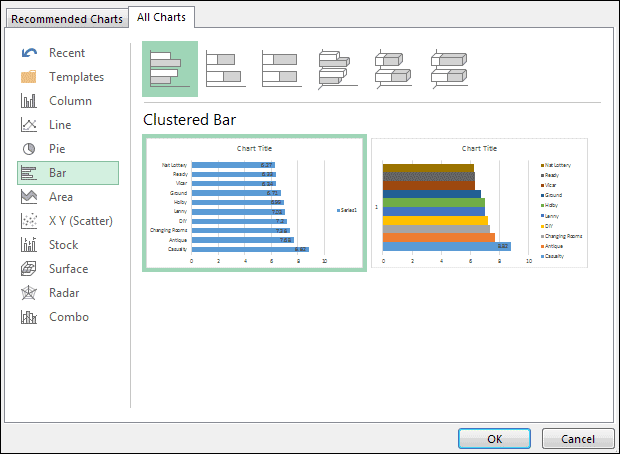
Select Bar from the list on the left of the dialogue
box, and click on the first Bar chart (Clustered Bar). Click OK to see
your chart change:
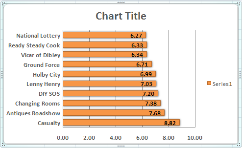
You can experiment with the types of chart in the dialogue
box. But reset it to Bar chart, as above.
No comments:
Post a Comment