Create a 2D Line Chart in Excel
For this last chart, we'll compare the viewing figures
of BBC1 and ITV. A line chart is better for this type of data. The chart
we'll create looks like this:
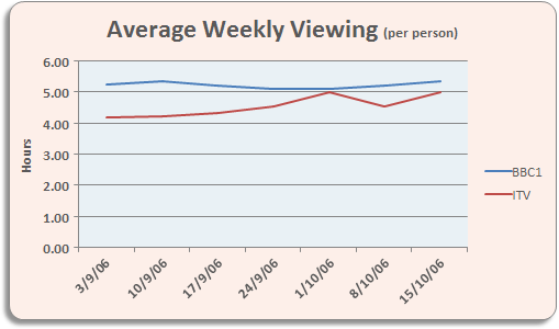
We're comparing how many hours per week a person watches
BBC1 with how many hours they watch ITV. You'll need some data, of course.
Start a new spreadsheet and enter the same data as below:

Once you have your spreadsheet data, highlight the cells
A3 to H5. Now click Insert from the Excel Ribbon bar. Locate
the Charts panel, and click on Other Charts. From the
menu, select All Chart Types (In Excel 2013, there is no Other
Charts option. See below for what you should do):

In Excel 2013, click the Recommended Charts item
instead of Other Charts:

When you click All Chart Types, you'll get a dialogue
box popping up (Excel 2013 users shoudl click the All Charts
tab on their dialogue box):

From the dialogue box, the left hand side shows all the
chart templates. Click on Line. Select the first Line chart,
the one highlighted in the image above. Click OK and Excel will insert
your chart. It should look like this:

The chart looks a bit plain, at the moment. You can change
the colour of the lines for BBC and ITV. Locate the Chart Styles
panel on the Design menu:
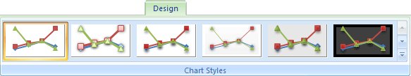
Click the down arrow on the right of the Chart Styles
panel to reveal the available styles:

We've gone for the first one, top left. When you select
a style, your chart will change:

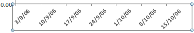
The lines are more distinct now. The dates at the bottom
don't look too impressive, though! In the next part, you'll see how
to format the dates on the bottom Axis.
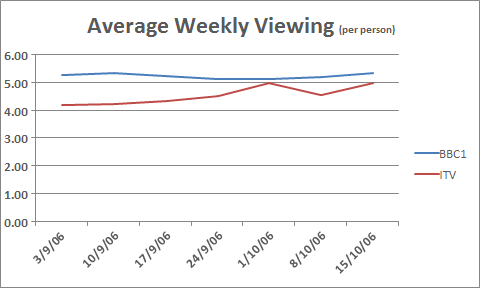
Format Axis Titles
From the previous lesson,
your 2D Excel Line Chart should look like this:
To format the dates on the bottom Axis, click on them
with your left mouse button. With the dates Axis selected, right click.
You should see this menu:

Select Format Axis from the menu, and you'll see
the following dialogue box appear (Excel 2013 users will see a panel
appear on the right of the screen, instead of a dialogue box):

Under Axis Type, select Text Axis:

Your dates should end up in the middle. (Our version of
Excel was a little buggy. We had to click Date axis, then click back
on Text axis to get the dates in the middle.)
Adding an Axis Title
To add an Axis label at the top of your chart, if you
have Excel 2007 or Excel 2010, click the Layout menu at the top
of Excel. Then locate the Labels panel:

Click on Chart Title. From the menu, select Above
Chart:

If you have Excel 2013, however, stay on the Design
Ribbon and locate the Chart Layouts panel on the left, just under
the File menu. Click Add Chart Element, then Chart Title >
Above Chart:

You will then see a default title appear at the top of
the chart. Highlight the text, and type a title of your own:
Add a Left Axis
We now need to add an Axis for the numbers running up
the left of the chart. The numbers are the hours per week that people
watch each channel - 0 to 6.
From the Labels menu still, select Axis Titles > Primary Vertical
Axis Title > Rotated Title:
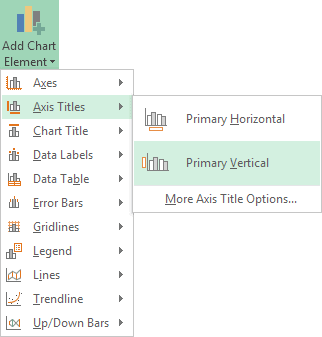
(Excel users won't have Rotated Title option -
the title will roate by itself.)
This will add a title like the following one:

Highlight the default title and type Hours. You
can move the title to the left by clicking and dragging. This is a little
tricky, though! Use the Zoom tool at the bottom of Excel to zoom in
on your target:
Move the Axis in to position:

When you're done, your chart should now look like this
one:

Spruce it up a bit by adding a bit of fill colour, rounded
edges, and shadow. You've already done this previously,
so we won't go through it again. When you're done, it may look like
ours:
And that's it for line charts. If you've been following
along from the beginning, you should now have some impressive Excel
chart skills.
Predicting future values with Excel Charts
Excel can help you make predictions about future values, or help you spot a linear trend. What we'll do in this section is set up something called a Trendline. We'll use an X, Y Scatter chart for this. We'll take a look at future income predictions based on what was earned in previous years. If you're a bit confused, don't worry: it will all become clear as we go along.Type the following headings into cells A1 to C1:
Year Years since 2006 Income
Format the cells, if you prefer. Your spreadsheet will then look like
this:


Highlight the cells B1 to C9:

From the top of Excel, click on the Insert ribbon. From the Charts panel, locate and click on the Scatter charter icon. The icon looks like this:

A new chart will then appear on your spreadsheet. It should look like this:

All these dots seem to form a loose line going up from the left. You could add a line yourself using the Shapes item on the Illustrations panel. What you'll then have done is to create a linear regression.
Rather than add the line ourselves, however, Excel can add the line for us. Not only that, it can give us the formula it used to create the line. We can use that formula to predict future incomes.
Click on your chart to highlight it. You should see three icons appear on the right, in Excel 2013. (See below for Excel 2007 and Excel 2010.) Click on the Plus symbol, and put a check in the box for Trendline:


The line represents Excel's best fit for a linear regression. It's trying to put as many as the dots as it can as close to the line as possible.
To see the equation Excel used, click on the Plus symbol again (Excel 2013). Then click on the arrow to the right of Trendline. A new menu appears. Select More Options at the bottom:

For Excel 2007 and 2010 users, Click the Layout tab again. Then click the Trendline on the Analysis panel. From the Trendline menu this time, select More Trendline Options. You'll then see a dialogue box with options the same as the ones in the image below.

When you check the box you should the following equation appear on your chart:
y = 564.88x + 13604
This is something called the Slope-Intercept Equation. If you remember
you Math lessons from school, the equation is usually written like this
(the "b" at the end may be a different letter, depending on
where in the world you were taught Math):
y = mx + b
In this formula, the letter "m" is the slope (gradient) of
the line, and the letter "b" is the first value on the y axis.
The x is a value on the X-Axis. Once you have the slope of the line,
a value for the X-Axis, and the starting point of the line, you can
extend the line, and work out other values on it. This will be the letter
"y" in the equation.Excel has already worked out two values for us, the "m" and the "b". The "m" (the slope) is 564.88 and the "b" is an income value of 13604.
To work out the y values we just need an "x". The "x" for us will be those "Years since 2006" in our B column.
Click inside cell C10 on your spreadsheet, then. Enter the following:
=564.88 * B10 + 13604
Press the enter key and you should find that Excel comes up with a
value of 18123.04. This is the predicated income for the year 2014.
Use Autofill for the cells B11 to B15. The rest of the predicted values
will then be filled in:
Sparklines
Sparklines are mini graphs that you can add to cells in your spreadsheet. They were introduced in Excel 2010, and look like this:
To add Sparklines to your own spreadsheets, start with some data. (You need more than one value, otherwise you'll just have a dot.) In a new Excel spreadsheet, type the following exam scores:

If you want an exact value for the height, click inside of any cell on row 8. Locate the Cells panel on the Home ribbon at the top of Excel:


Adding a Sparkline to a Spreadsheet Cell
To add a Sparkline, click inside of cell A8. Now select the Insert ribbon from the top of Excel. From the Insert ribbon, locate the Sparklines panel:

Your Create Sparklines dialogue box should look like this:

When you do click OK, your A8 cell will look like this:

Thanks for sharing such amazing content which is very helpful for us. Please keep sharing like this. Also check to learn Microsoft Excel 2007 for Beginners or many more.
ReplyDelete