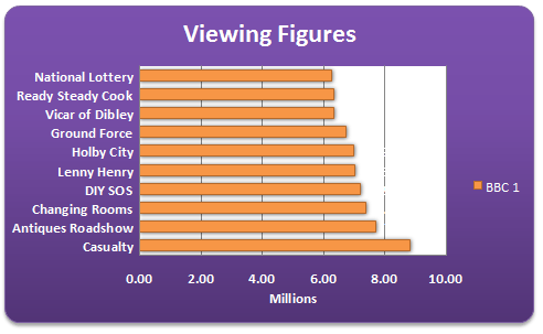
The Chart Title and Series Title
Your chart from the previous
section should now look like this:
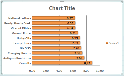
Once you have your chart in place, there are plenty of
formatting options in Excel. In the chart above, for example, the title
says "Chart Title". And there's a not terribly descriptive
orange square that says "Series 1" (your bars may be blue).
We'll see how to change that in a moment. But first, the Chart Title.
(If you don't have a title in Excel 2010, select the first layout in
the Chart Layouts panel.)
How to Change the Chart Title
To change the title of your chart, click on the title
to select it:
The circles surrounding the title tell you that it is
selected. Once the title is selected, click on the letter "C"
of Chart. Hold your left mouse button down and highlight the two words,
as in the image below:
Once your title is highlighted, you can change it by simply
typing a new one:
While the title is highlighted, you can select a different
font and font size, if you want (on the Home panel in the Excel Ribbon
at the top.)
To deselect the title, click anywhere outside of it.
Formatting a Series Title
To change the Series 1 text on the Chart heading
to something more descriptive, select the title as you did above:
Make sure the circles are there, and then right click.
You should see the following menu appear in Excel 2007:

Click on "Edit data source". Alternatively,
click the Edit data source item on the Data panel on the
Excel 2007 Ribbon:

For Excel 2010 and 2013 users, your menu looks like this:

The item to click on the menu above will say Select
Data instead of Edit Data Source.
In both versions you should then see the following dialogue
box appear.

The Chart Data Range at the top of the dialogue
box is highlighting the cells A5 to B14. This is the data we selected
for the chart. Below this there is an area for Legend Entries (Series)
and Horizontal Axis Labels. We'll see more of these later. For
now though, we just want to change Series 1 into something more descriptive.
So click on Series 1 to highlight it. Then click the Edit button, as
in the image below:
When you click the Edit button, you'll see a new
dialogue box appear - Edit Series. It should look like this:

Notice the cells being referenced in the Series name
area. They are cells A5 to B14. These same cells are also highlighted
on the spreadsheet:

Click on the BBC title instead, the one on Row 3 above.
Your Edit Series dialogue box will have changed. The Series Name area
will now say A3 (amongst all those dollars):

Click OK to get back to your Edit Data Source dialogue
box. The Series legend will now say BBC:

Click OK to return to your spreadsheet. But look what's
happened to the chart. The Series 1 has gone. Next to the orange
square, we now have BBC 1:
We'll meet these boxes again when we create a chart from
scratch. For now, let's see some more formatting option you can do with
an Excel chart.
The Chart Layout Panels
In the previous part
of this lesson on charts, you saw how to format a chart with various
dialogue boxes.
You can also format your charts using the menu items on
the Excel Ribbon bar, at the top of the screen. With your chart selected,
click the Layout menu (Not Excel 2013. See below for your Layout
options). You should see this:


The Layout menu is a bit big for this page, so we've split
it in two. But the chart Layout panel is split into a number of different
sections (six in our version), and allows you to change the information
in the chart.
For Excel 2013 users, your Layout options are on the Design
tab still, on the far left, just under the File menu:

Click Add Chart Element to see th efollowing drop down
list:
For all versions of Excel, The first thing you may want
to do is to give your chart a name.
To change the name of your chart in Excel versions 2007 and 2010, locate
the Properties panel on the Layout menu:
Highlight the default name in the textbox and type a new
one:

If you now click away from your chart, and then click
back on it, you'll notice the name of the chart change:
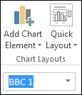
For Excel 2013 users, locate the Name box just below Chart
Layouts:
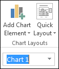
Highlight the default Chart 1. Type a new name (BBC 1)
and press enter:
The Labels Panel in Excel 2007/2010
The Labels panel on the Layout menu lets you format
the titles and legends on your chart. Here it is:

Or this for Excel 2013 users:
The first one is Chart Title. Click the arrow to
see the options:


Click each item on the menu in turn to see what they do.
Then click More Title Options. The following dialogue box will
appear (Excel 2010 has more options. Excel 2013 users, see below for
your options.):

As you can see, there are options to change the Fill,
Line, Line Style, Shadow, 3-D format, and Alignment. Play around with
the options on the dialogue box to see what they do. The only thing
you're changing here is the Chart Tile. Click Close when you're done.
If you don't like what you see, click the undo arrow at the top of Excel.
Formatting Chart Titles in Excel 2013
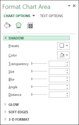
Excel 2013 users won't see a dialogue box. Instead, you'll see a panel appear on the right of the screen. This one: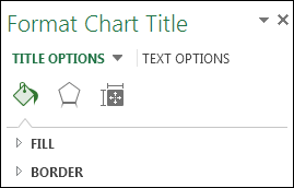
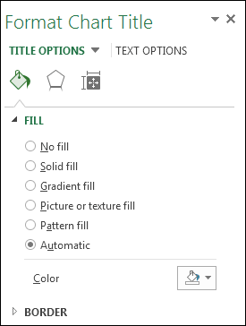
Click the Hexagon and you'll see these options:


Change the Axis Title in Excel 2007/2010
The next item on the Labels panel is the Axis
Title. Click the down arrow to see the options:

At the moment, our chart has no Axis Title. It just has
numbers running across the bottom. Someone looking at the chart won't
know what the numbers represent. Here's what our Chart looks like at
the moment:

To add an Axis title in Excel 2007 and 2010, click on
Primary Horizontal Axis Title. From the sub menu, click Title
Below Axis.

In Excel 2013, select Primary Horizontal on the
Axis Titles menu of Add Chart Elements:

When you click Title Below Axis or Primary Horizontal,
a new title will be added to the chart:
Highlight the default text, and type your own:
Click away from the chart to see what it looks like:
We now have some explanation for what the numbers represent.
You can add a Vertical Axis, as well. Click on Primary Vertical Axis
Title and see how it works.
Chart Legend
The Chart's Legend is this one:
At the moment, our Legend is on the right of the chart.
But you can move this. Click the Legend item on the Layout
panel to see the various options:
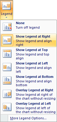
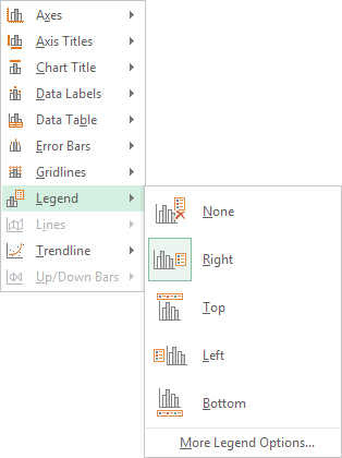
Click an option on the menu and watch what happens to
your Legend. You should see it move around your chart.
Adding Data Labels to an Excel Chart
A Data Label is information overlaid on the chart bars.
In our chart below, we have numbers overlaid on the orange bars:
You can format these Data Labels. Click the Data Labels
item on the Labels panel to see the following options:


The one wat we have at the moment is Inside Edge.
Click on Outside End and your Data Labels will look like this:

You can also see the options if you click More Data
Label Options from the menu. You'll then see this dialogue box (In
Excel 2013, again, you won't see a dialogue box. Instead, you'll see
the Format panel appear on the right of your screen. The same options
as below will be available, however.):

Again, play around with the options to see what they do.
The first two, Label Options and Number, are the ones you'll probably
use most often.
The Format Chart Panel
In the previous lesson,
you saw how to use the Layout panels to change the layout of
the chart itself. The Format panels allow you to create some
great looking charts with just a few mouse clicks.
Click on your chart to select it, and then click the Format
menu at the top of the Excel Ribbon. You should see this long menu,
split in two here:


Using the various Format Panels on the Excel Ribbon,
we'll format our chart from this:

To this:
OK, it may look a bit gaudy! But at least it's lively.
You can create a chart like this quite easily:
- First, click on your chart to highlight it
- Click the Format menu on the Excel Ribbon
- Locate the Shape Styles panel:

Click the down arrow on the right of the panel to see
the available styles (there might not be so many styles in Excel 2013,
so you my have to select a different colour):
When you move your mouse over a style, your chart will
change automatically. But you won't be able to see the full effect until
you click away from the chart. We went for Style 28, the one that's
highlighted in the image above. You get the rounded corners, the drop
shadow and the colour fill.
Create your own Chart Style in Excel
You can create all that yourself, though. If you want to create your own style, try the following:
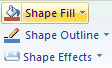
Fill your chart with a colour by clicking the down arrow
on Shape Fill on the Shape Styles panel:

Select a colour from the list. Or click "More Fill
Colors". Once your chart has a colour, you can liven it up a bit.
Still on the same menu, click on Gradient. The
sub menu appears:

We went for one of the Dark Variations.
Next, you can spruce up the text on your chart. Locate the WordArt
Styles panel:
Click the Text Fill button to see the available
colours:

Once you have the chart background and text formatted
the way you want it, you can add some rounded corners, and a bit of
drop shadow. You can apply both of those from the Format Chart Area
dialogue box. Here's how.
To bring up the Format Chart Area dialogue box, click the Format
Selection button on the Current Selection panel:
You'll then see the following dialogue box appea (If you're
using Excel 2013, you'll see a panel appear on the right of your screen
instead of a dialogue box):

To get rounded corners, click on Line in Excel
2007. You'll then see the following options:

In Excel 2010, you'll have a Border Styles menu
on the left. Click that to see the Rounded Corners option. For Excel
2013, click the Border category to exapand it. The Rounded Corners
options is at the bottom:

Put a tick in the box for Rounded Corners.
To get a Shadow for your chart, click the Shadow option
on the left of your dialogue box. The options will change to these:

For Excel 2013 users, click the Hexagon symbol at the
top, just to the right of th epaint bucket:
Click the Presets button to see a list of pre-made shadows:
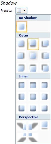
Select the one you like. Then click Close on the dialogue
box. Your chart will then have rounded corners and a drop shadow.
No comments:
Post a Comment